Issues raised:
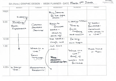
Need to look at children's wall charts / animal drawings etc.
Think about colour and format it will take.
Action to be taken:
Conduct a little more visual research and collect images of the animals.
Start to draw and explore how colour can fit in with the images and how it will take a format.
Tuesday 16 March 2010
Monday 15 March 2010
Design is a virus - crit 1
Feedback from Gemma and Meryem in italic, Kim and Nick in bold.
- How professional was the verbal element of the presentation? Was it delivered with clarity? What might have improved it?
Clear presentation - informed research. Looking into different types of donation.
Some confusion as to what information was essential. - How professional was the visual element of the presentation? How well were the boards designed? What might have improved them?
They were clear but could have been worked on more visually.
First board with image and type was clearer than the other two purely type ones. - Proposal - What is the message?
More people to sign up to donate organs.
Trying to get people to donate organs. - Is there a clear sense of audience? Who is the project targeting?
People who don't already donate. 16 - 25.
Yes, clear sense of audience. 16 - 25 - consider age range - is it too broad? - What context will the message exist in? How does the proposal solution answer the 'virus' element of the brief?
Wide range of delivery. Research shows younger age groups are not as aware or willing to donate.
Information pack and website. - Overall, what do you think of the proposal?
Good idea, the theme is interesting and relevant in terms of donating.
Strong idea.
What we got from the crit and ways we could develop / look at: - We will need a lot of information on the site / leaflet etc - how to cope with say - one kidney, look at risks etc (for living donors).
- Do we do two versions - a simple one to get people thinking about it - and a more detailed version for those that want to take it further and actually sign up?
- Advertise - proposed meeting sessions with doctors / counsellors etc - discussion groups - speak to people to be reassured.
- Case stories?
It was a really insightful crit and I feel we got some good points back from it to consider further which was helpful as the topic for our brief is quite serious and needs addressing sensibly, sensitively and have lots of information - which we will need to figure out how to put down effectively.
Design is a virus - why me and Josh are working together and what we have to offer.
- My respones in italic - Josh's in normal text.
- Why have you chosen to work with your creative partner? What are your aims?
- Good at idea generation / concepts, Good Communicator, Think we will be able to discuss and change our ideas well enough without arguing.
- Organised, On the ball, good at ideas / concepts.
- What are your specific areas of creative interest in this brief?
- It's something I've considered doing myself (donation) thought it would be quite interesting to look at.
- "Poster"
- What specific design skills do you have to offer in relation to your chosen brief? How do you intend to use them?
- Type, To some degree - layout, illustration, photography...
- Illustration
- What specific non-design skills do you have to offer in relation to the chosen brief? How do you intend to use them?
- Organisation, Keeing in time frames, Keeping blogs up to date.
- Organisation, Keeing in time frames, Keeping blogs up to date.
- What will your specific roles be in the collaboration in relation to the brief?
- Making the website, Ideas generation, formats of the leaflets / cards / pack etc.
- Poster / leaflet / Forms, Ideas generation.
- What will your individual responsibilities be in relation to your brief?
- Printing.
- What will your joint responsibilities be?
- Budgeting, Time management, Compromising.
Wednesday 10 March 2010
What is a line? revised brief
I decided I was becoming a little confused as to what I was aiming for with the last brief so I have revised what I am doing:
The brief:
"A connected series of events, actions or developments" - Focusing on animal anatomy and evolution.
Background:
Context - environmental issues - with what is happening in the world - i.e. global warming etc it came to my mind that land animals are probably going to have to adapt to their new surroundings and quite possibly have to evolve - what I find interesting is what they could evolve into.
Considerations:
Research - maybe what animals have evolved from? Could they revert back?
Will it be colourful? What type of drawings? Build something 3D then photograph? What format will it take?
Target Audience:
Think children would most appreciate this.
Tone of voice:
Want it to be informative and to some extent educational - but if it is aimed at children it needs to have a little hearted feel to it.
Mandatory Requirements:
Body of visual research in sketch books.
'Final' outcome.
Deadline:
March 23rd 2010 - then refined for April 20th.
I am glad I changed what I am going to do as it seemed well received - just hope I can do it justice now.
Design is a virus - written brief
- Collaboration brief with Josh.
- The Brief: "Get people to give more" - organ donation.
- Background: Lots of people needing organ transplants and dying due to lack of donors - both living (kidney, bone marrow, blood etc) and dead (hearts, lungs, livers etc). We want to encourage more people to become i.e. sign up to become a donor.
- Considerations: Colours, imagery - to be sensitive. Do we post it out? Send to the NHS?
- Target audience: 16 - 25 year olds - not many from this age range signing up - need a new influx and a campaign targeting this group so they are aware.
- Tone of voice: Sensitive but shocking ish in a fair way.
- Mandatory requirements: Research / Visual research / Outcomes etc.
Tuesday 2 March 2010
Book Fair
 Rationale for book fair books
Crit after the rationale:
Issues raised:
A3 or A4?
Hand drawn or printed?
Poster or just a book?
What stock?
Actions to be taken:
Need to take some more photographs.- various colours.
Need to figure out layout and if there are any cut outs in the book.
Figure out which stock to use.
Blocks of colour or just the photo in it's original state?
VOGUE!
Vogue self written brief for don't panic online poster competition
 "Final crit" With Gemma, Jo, Chris, Brian and Ross, of the proposed 3 posters (design practice blog)
 "Final crit" With Gemma, Jo, Chris, Brian and Ross, of the proposed 3 posters (design practice blog)
- What concept/statement/fact/ tone is being communicated?
Looking at control in fashion industry and the health side.
Control/ fake/ shallow/ French.
Good, visually interesting to think about.
Fashion controls everybody. Good statement.
Social comment, French, fashion industry as puppets. - Is this being communicated effectively?
Control - communicated through the puppet element. Health - the skeleton.
Yes, hard hitting.
Yes an interesting but well thought out meaning.
Very well. The image is strong and gives a message.
Yes, image and type work well together. - Has the posters answered the brief?
Yes, definitely. The image itself could work as a poster on it's own.
Yes. Express Vogue as negative imagery.
Gives a good message and view about Vogue. Specifically targeting the fashion market. - Who is the audience - have they been addressed?
Students - maybe more females - illustrate to them it's not all it' cracked up to be.
Anyone - but image is quite specifically feminine to encourage people not to conform.
Female? Anyone into fashion.
Youth culture / society / females. - Strengths?
You've kept the elegant theme - ornate decoration on mirror, which seems quite sinister - in a good way! As I don't think the negative of the fashion industry is ever portrayed as horrible as it is. This works great without the usual photographs of bones.
Really effective image - visibly understandable.
Good to look at a hidden meaning.
Strong message, illustration in centre piece.
Extremely strong visual idea. - What could be developed further?
Moving the text onto the mirror edge? - maybe etched?
Different poses? Colours? Fonts?
Maybe add text into the frame?
Possible use of colour. Type / text variations. - Further feedback...
Think they all look really well, the visual and message is strong and communicated effectively.
Subscribe to:
Posts (Atom)


